Go Give App
An app to simplify volunteer sign up
Scope
User Research, User Experience Design, Visual Design, Usability Testing, Prototyping
Role
UX Designer
Timeline
4 weeks
Client
Bootcamp Student Work
Tools
Figma, Zoom, Undraw, Icons 8, Google Survey

Introduction
Many people want to volunteer, but finding opportunities is the biggest challenge. This app makes it easy to discover opportunities.
Background
Only a quarter of Americans volunteer. Why don’t more people do it?
In my initial research, I found only about 25% of Americans volunteer. Although this is still an impactful number, there is a lot of untapped potential. Reflecting on my experience of struggling to find volunteer opportunities, could this be the reason for the relatively low participation rate?
To gain a deeper understanding of the issue, I conducted a competitive analysis of other volunteer platforms, surveyed volunteers to find patterns, and interviewed users to gain insights into the challenges people face when trying to get involved.
60.7
Million volunteers
$122.9
Billon in economic impact and value
The Vision
Encourage more people to volunteer by making search and sign up more accessible with Go Give.

Competitor Analysis
Search and sign-up processes on volunteer platforms are outdated and restrictive.
Extensive sign-up
The established sites are bureaucratic, with extensive sign-up processes and long forms.
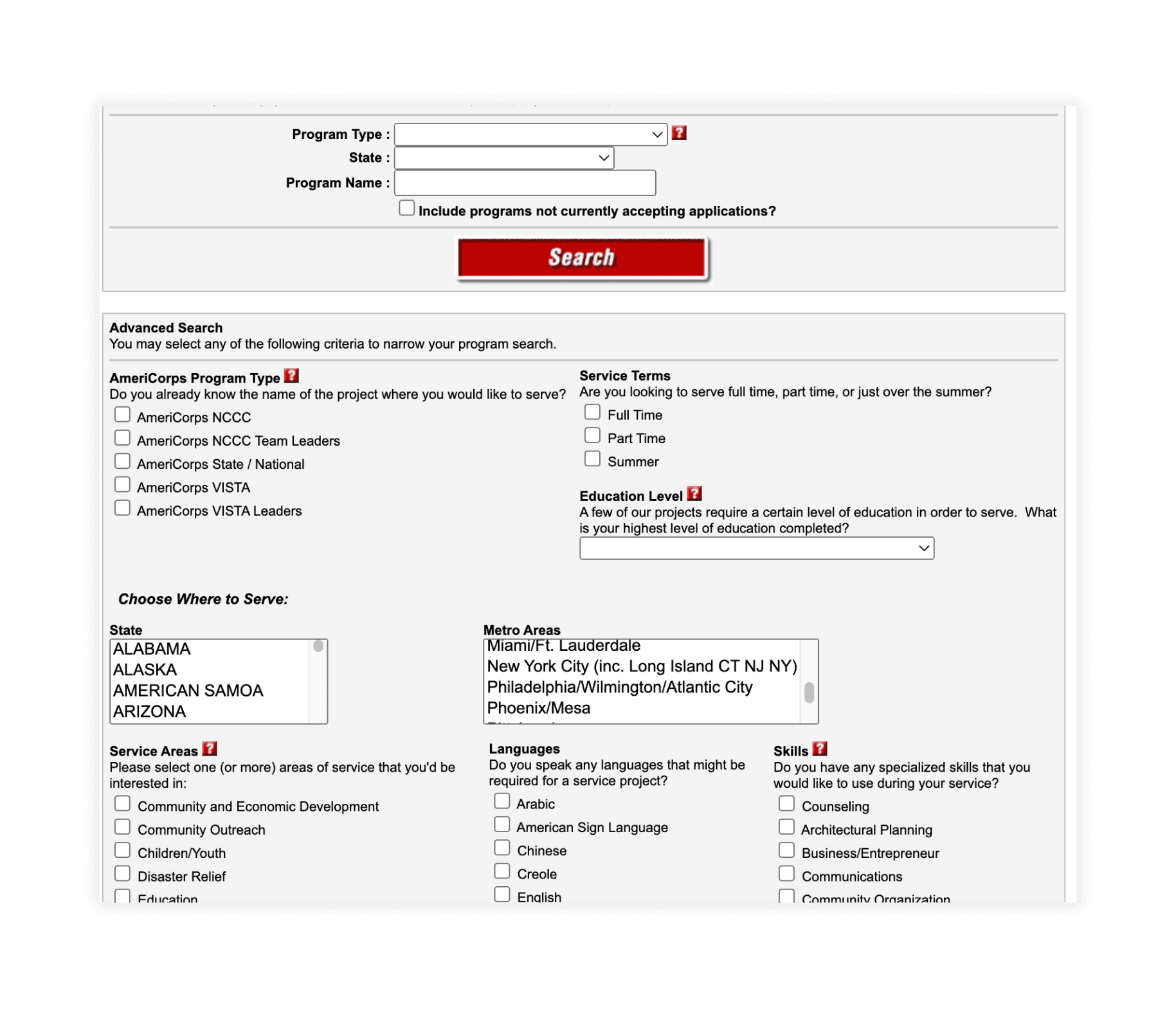

Limited events & information
Many sites have limited volunteer opportunities and information. They also don't allow direct sign up for events.
User Surveys
Gaining a broad view of the challenges in volunteering to understand obstacles.
I surveyed 26 individuals, with Google surveys, about their experience volunteering. The surveys focused on when they last volunteered, what they looked for when volunteering, and what frustrations they faced.
Search and group sign-ups
Many want to volunteer again but find the search process a bit difficult and prefer volunteering with others.
Can't find people and places
Respondents shared their frustrations about what would motivate them to volunteer, struggling to find both opportunities and people to volunteer with.


User Surveys
Understanding volunteers by exploring their experiences and motivations.
I interviewed 6 individuals who have volunteered in the past but haven’t volunteered in the last year. The goal was to understand why they haven’t volunteered recently.

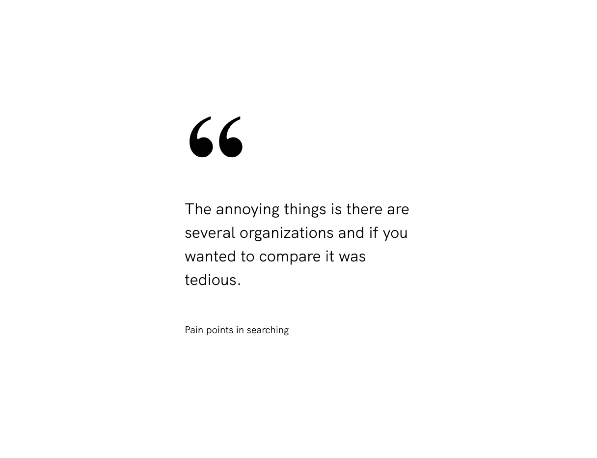

Challenges in sign-up and staying motivated
Finding and comparing volunteer options is tedious and feels like a job application; volunteering with friends could improve motivation.
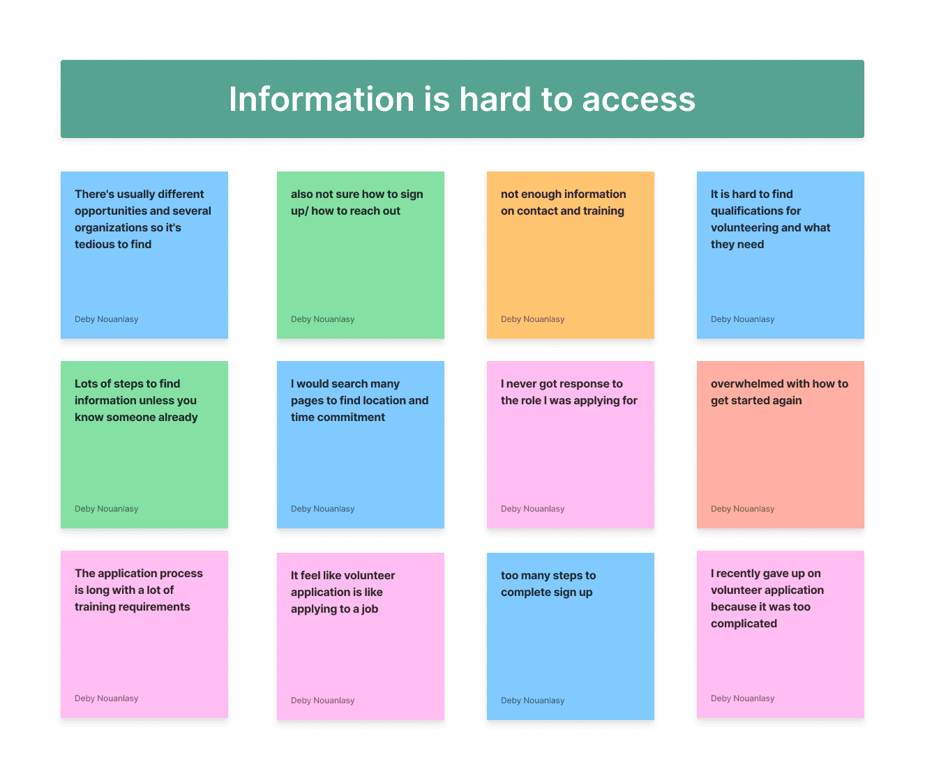
Affinity Mapping
Barriers to volunteering and why people haven't been active.
Major insight: information is difficult to locate

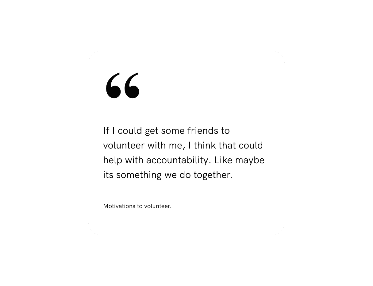
Major Insight: People Lack Motivation to Volunteer
People feel more motivated to volunteer when they have friends involved and a sense of accountability to keep going together.
Define the Problem
Turning pain points into powerful features
After identifying user frustrations and issues in the current design, I reframed user problems to help target user needs and breakdown design challenges.
Pain point
I searched through many pages to find the location and time commitment.
HMW
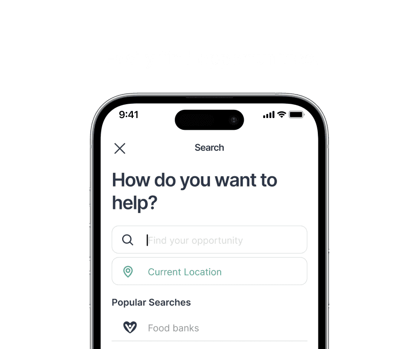
How might we make it easier for users to quickly find important information searching for volunteer opportunities?
Search and filter
Users can quickly type in key phrases to look up opportunities and tailor their search results.
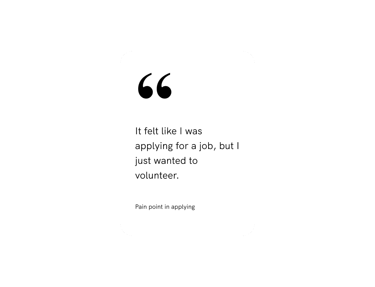
Pain point
I recently gave up on a volunteer application because it was too complicated.
HMW
How might we simplify the volunteer application process so that more people feel encouraged to complete it?
Overview and contact
Users can scan volunteer profiles for important information and connect with with organizations.
Pain point
I need more accountability and friends to volunteer with.
HMW
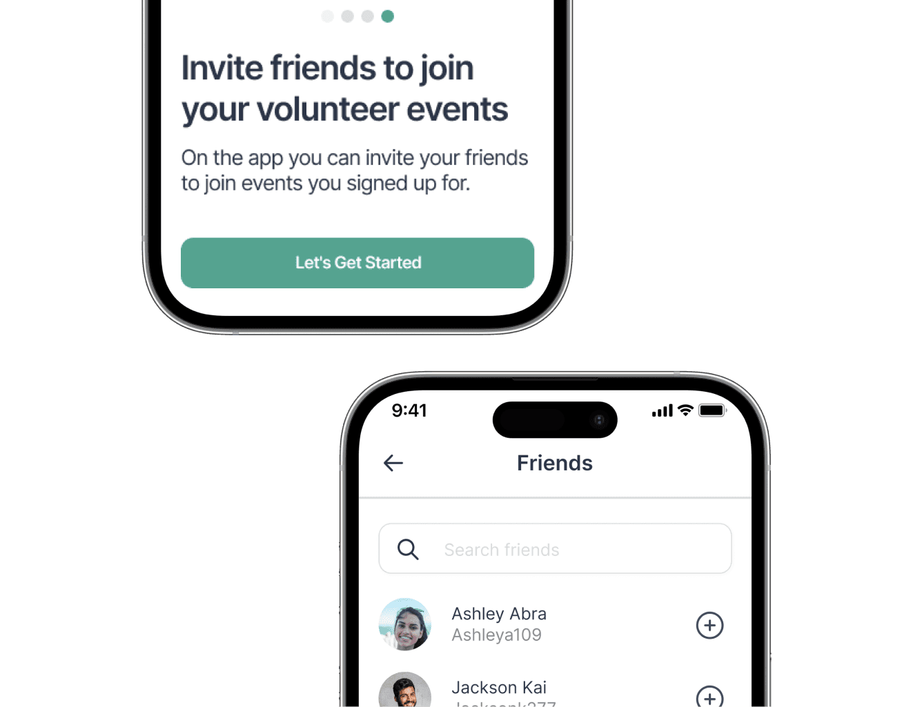
How might we make volunteering more social and motivating by helping people volunteer with friends and stay accountable?
Invite and share
Users can easily share and invite friends to volunteer opportunities they signed up for.
The Vision
A compassionate volunteer style guide.
The app portrays a friendly, compassionate, and supportive environment for volunteers. The logo is simple yet compelling with the heart and open arms. The colors give a tranquil ambiance with vibrant-youthful energy.


User Testing
User testing revealed important features and improvements.
I tested my designs with real users. I observed how they navigated through 3 key scenarios of creating an account, signing up for an event, and inviting a friend.

Account creation
100% of users felt the account creation process was straight forward and easy
Search process
100% of users felt the process of searching and finding a volunteer opportunity intuitive.

Invite feature
4/6 of users were confused on how to invite people to the volunteer event.
Volunteer availability
2/6 of users wanted to know times and availability for multiple days in sign up.
Iteration 1
Providing more context on the invite feature
Users were unsure how to invite a friend to a volunteer event. The onboarding screen didn't specify to users that the user could invite a friend to an event when signing up for an opportunity.
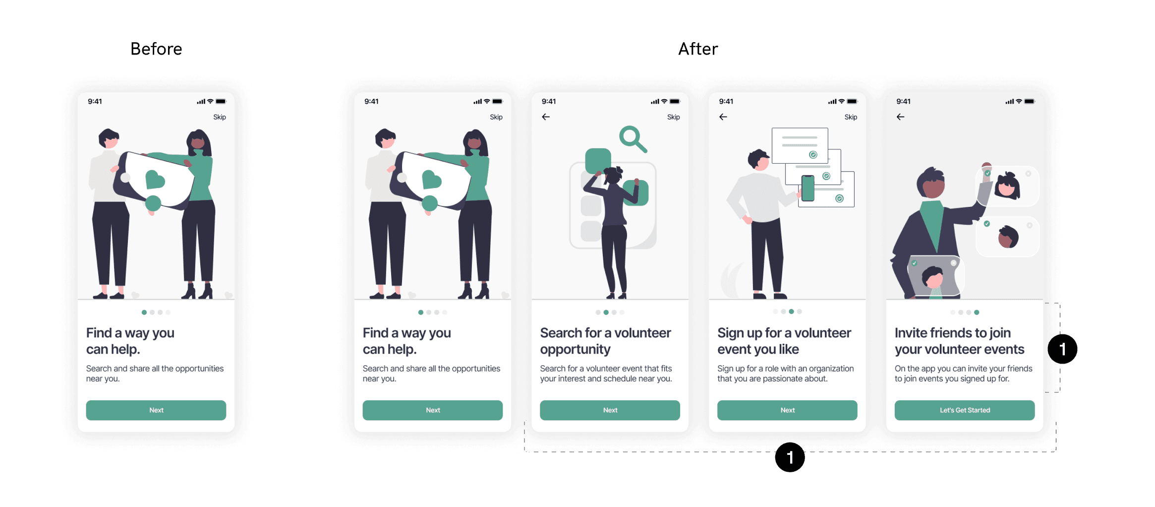
Improvements

Expanded onboarding
Users have a better understanding of the app purpose and key features.

Provided descriptive CTA at sign-up
Users are able to understand the capabilities of the app in the sign-up process.
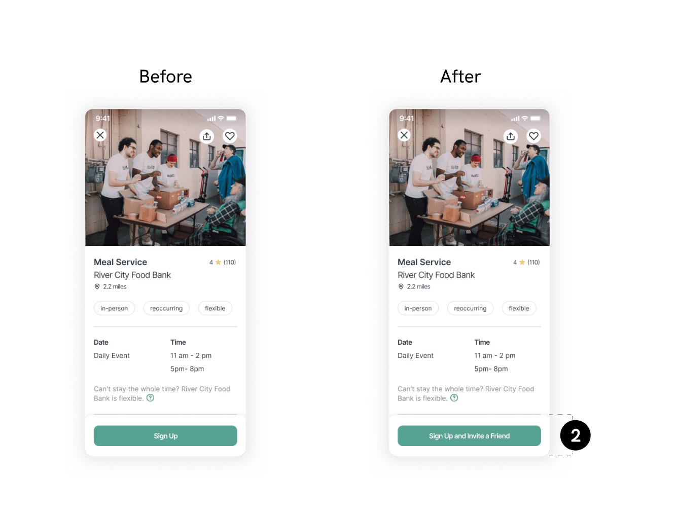
Iteration 2
Providing more context on availability
Users were unsure what other times and spots are available for other days. The information doesn't showcase all possible dates and availability.

Improvements
Added date & time screen
Users can see a more expansive view of dates and times to see a time that works better for them.
Rearranged sign-up screen
Users are able to view time and date selected and availability for that time slot, so they know if and how many other people to invite.
Metrics for Success
Success is measured by user engagement and successful sign-ups.
The success metrics are based on the main issues identified in testing. Moving forward, I would collect data on user interactions during onboarding and event sign-ups to see if the changes lead to more account volunteer sign-ups and group sign-ups with friends.
Step-by-step conversion rates
Tracks how many users successfully progress from one step to the next in onboarding and event sign-up.
Completion rates
Measures the percentage of users who complete the event sign-up and friend invite provess.
Takeaways and Learnings
Prioritizing core features to boost user experience and drive growth.
A product doesn't need to be good at everything.
I spent too much time worrying about too many features and not enough on the most valuable elements for users. By scaling back and focusing on the core function you can improve the user experience significantly.
Sign-up screenings & community design considerations.
There are also more areas to expand on and consider: How can we integrate community groups to create a stronger support system amongst users? How do users sign up for events that require additional screening and certification?
Next Projects