Ani App
Optimizing onboarding and simplify content sharing
Scope
User Experience Design, Design System, User Flows
Team
Startup founder, 1 other designer, 1 project manager, 2 developers
Role
Product Designer
Timeline
3 weeks
Client
Ani
Tools
Figma, Slack, Google Workspace, Mobbin
Introduction
Ani is a social media and tracking app designed for the anime and manga community. Our team focused on improving content sharing and app engagement to enhance the overall user experience.
The Vision
Streamlined onboarding and simplified content posting.


Background
Early launch revealed onboarding drop-off and posting issues.
Ani launched in early 2024 with little to no marketing efforts and quickly gained a user base, but drop-offs occurred highlighting areas of opportunity in the application. This motivated a complete revamp of the Ani application. For this case study, I will be focusing on onboarding and posting.
500
Users in 2 weeks
32
%
User drop-off in onboarding
70
%
Failure rate for content posting
The Problem Space
Listening to our users to refine the design and enhance functionality.
From our database and app metrics the team referenced data points from users. Information was gathered from the Admin panel and Discord. Here we found user patterns and referenced existing user feedback on the Discord channel. This helped lay the foundation for areas to focus on.
High drop-off rates in onboarding
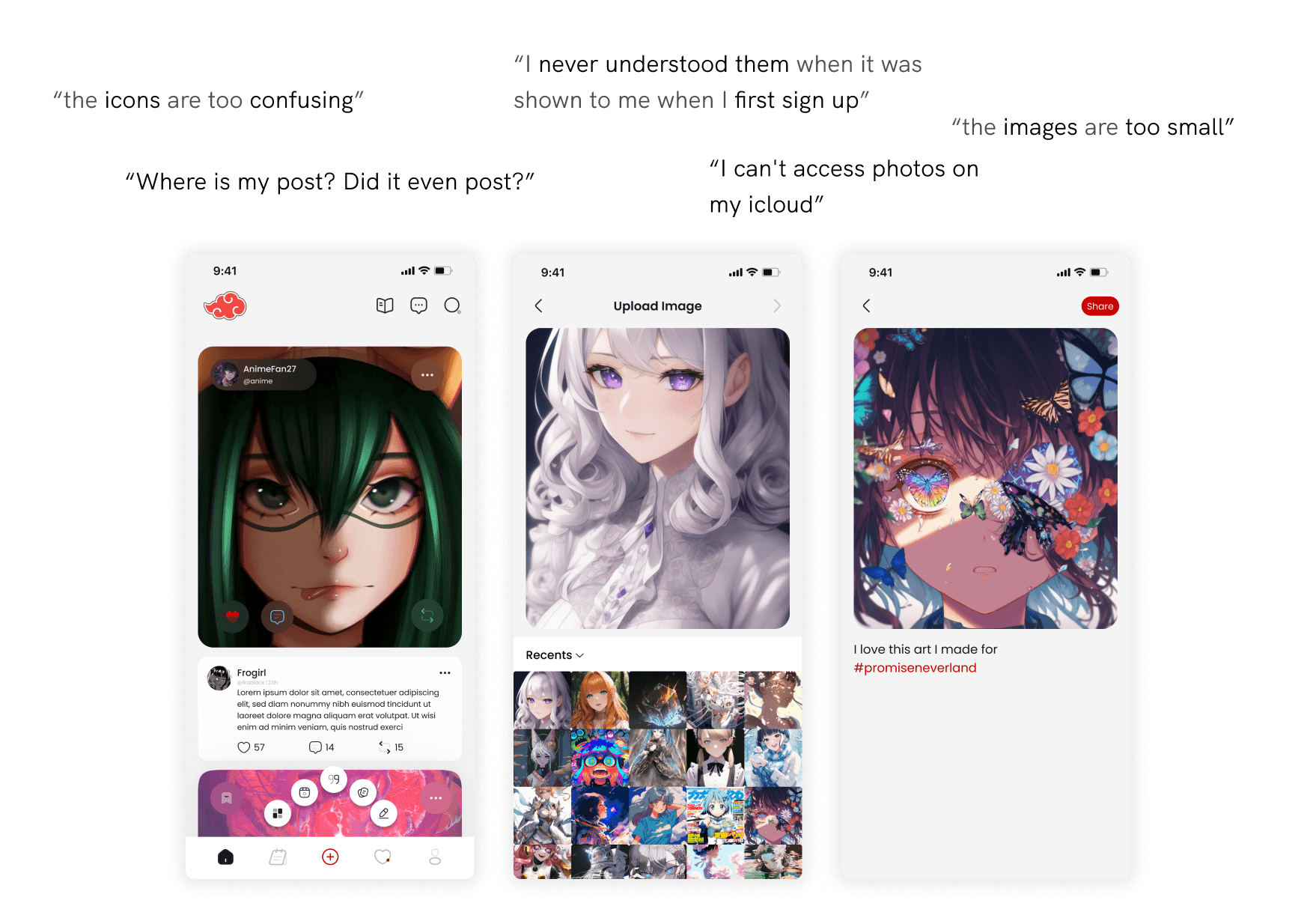
We found a 32% drop-off during onboarding due to confusion with tappable buttons. Users on Discord said they struggled to tell which buttons were interactive, showing the need for clearer design cues.
High failure rate in content posting
We found 70% of users couldn't upload and post media successfully. Users on Discord reported trouble finding images and uncertainty after clicking share, highlighting the need for easier image selection and clearer post confirmation.
Define the Problem
Reframing the challenges into user-focused solutions.
After identifying user frustrations and issues in the current design, I reframed user problems to help target user needs and breakdown design challenges.
Onboarding
How might we create an onboarding process that clearly guides users so they can understand key app features without overwhelming them?
Content Posting
How might we reduce friction in posting video and photo content so users can engage with the community?
Design Audit
Building on what we have to uncover opportunities and address design challenges.
User feedback and app data showed users struggled with onboarding navigation, image selection, and post confirmation. A design audit uncovered usability and accessibility issues, helping us fix these problems and improve the experience.
Onboarding concerns

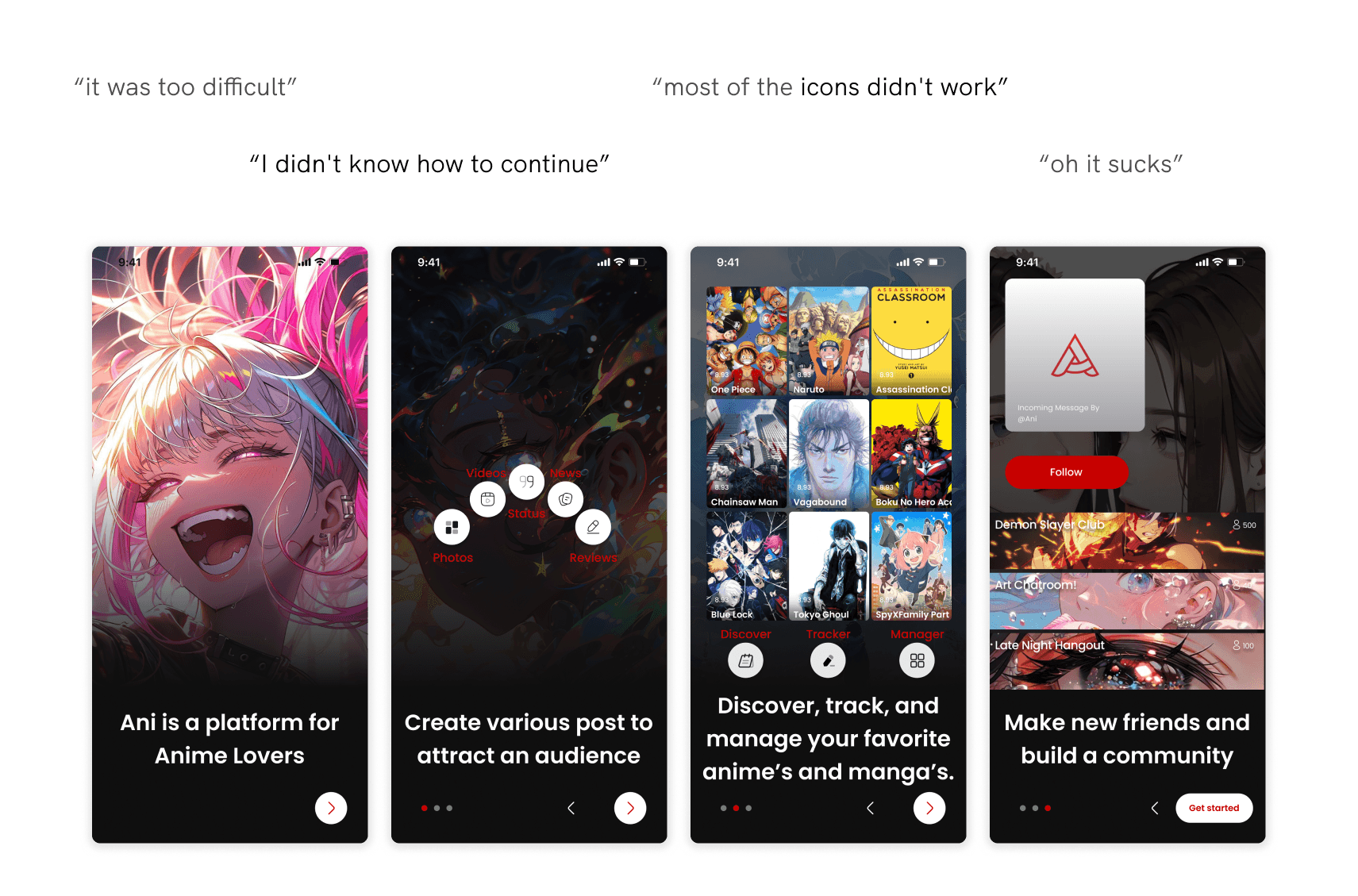
Unclear buttons
The icons didn’t seem clickable, and the text was hard to read. This made the buttons hard to understand.

Inefficient user flow
The button didn’t let users skip the onboarding, and they were stuck on the screen unless they clicked all the icons to move forward. This didn't give users flexibility.

Media posting concerns
Small touch points
The buttons were smaller than the recommended 44 x 44 pixels and didn’t explain their purpose.
Low visibility
The gallery images were too small and hard to see, with no clear separation between them. This made it hard for users to distinguish one photo from the other.

Limited user control
Users could only see recent photos and couldn’t take new ones or access cloud storage, limiting their options and flexibility.

Lack of feedback
Users could post from any screen, but after sharing, their content was not confirmed as uploaded unless they were on the home feed.

Onboarding Design Development
Designing an easy and intuitive onboarding experience.

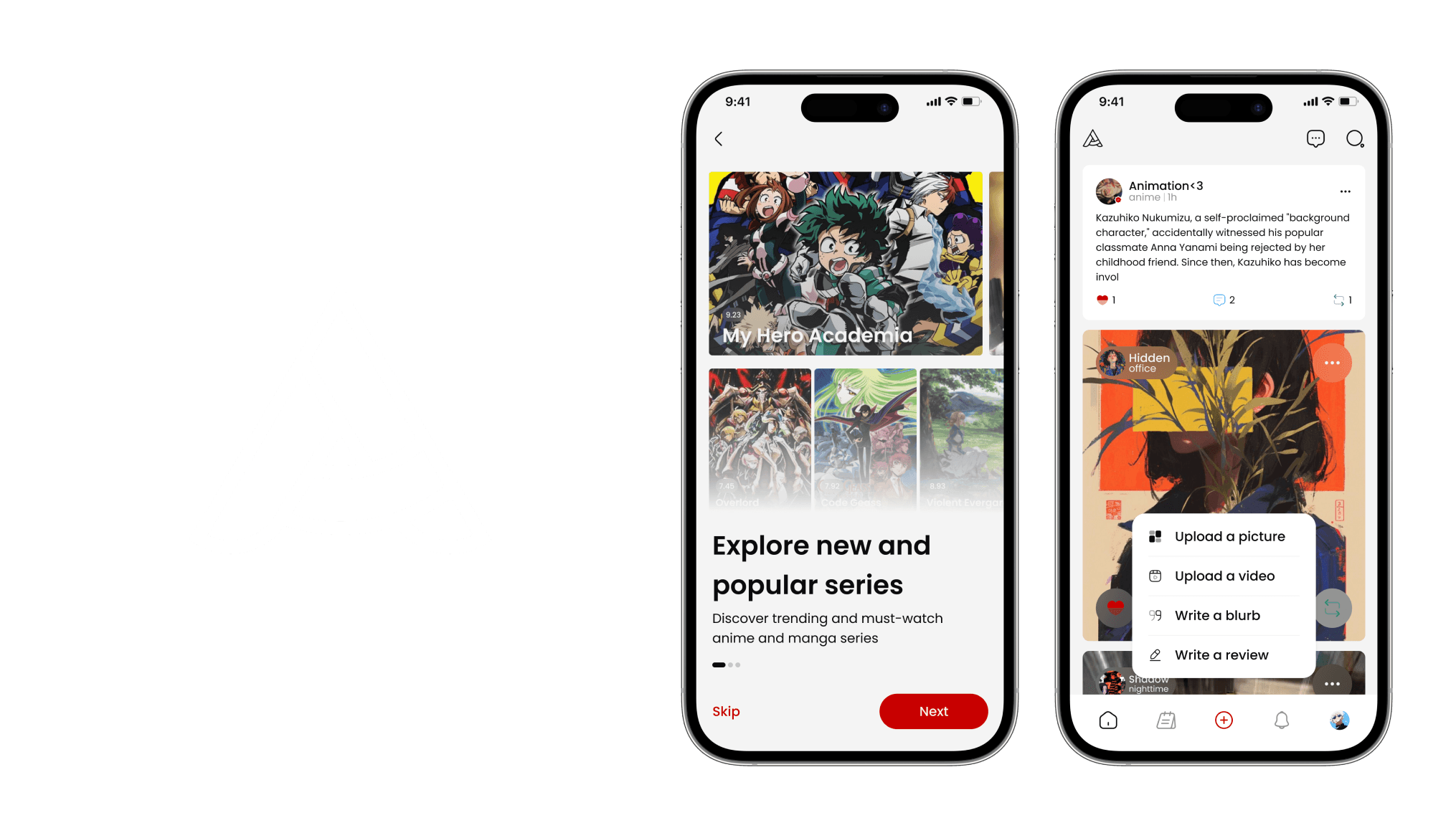
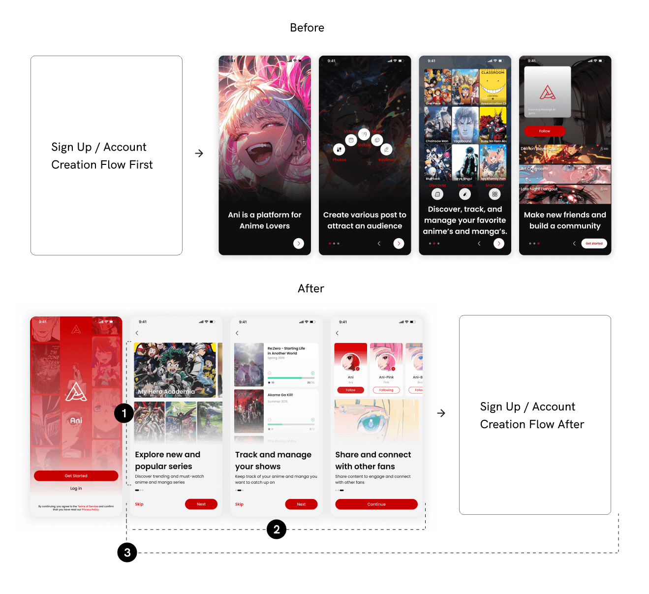
Option 1
This option focused on showing users icons and features to help them understand how to use the app.

Option 2
The second option had simpler onboarding with decorative images, focusing on anime illustrations.
A balanced design between simplicity and app content.
The product manager advocated for a simple design, while the CEO wanted to include key app elements to help users understand what the app does. We found a middle ground by creating a third option that balanced both simplicity and context. This solution kept the design clear and user-friendly while still offering the necessary app details.
Improvements

Content focused on MVP
Feature-focused content helps users understand what they can do in the app.

Clear navigation
Clear navigation simplifies the app onboarding process.

Early onboard introduction
Users can understand the app before creating an account.
Posting Design Development
Making content posting straight-forward for users.
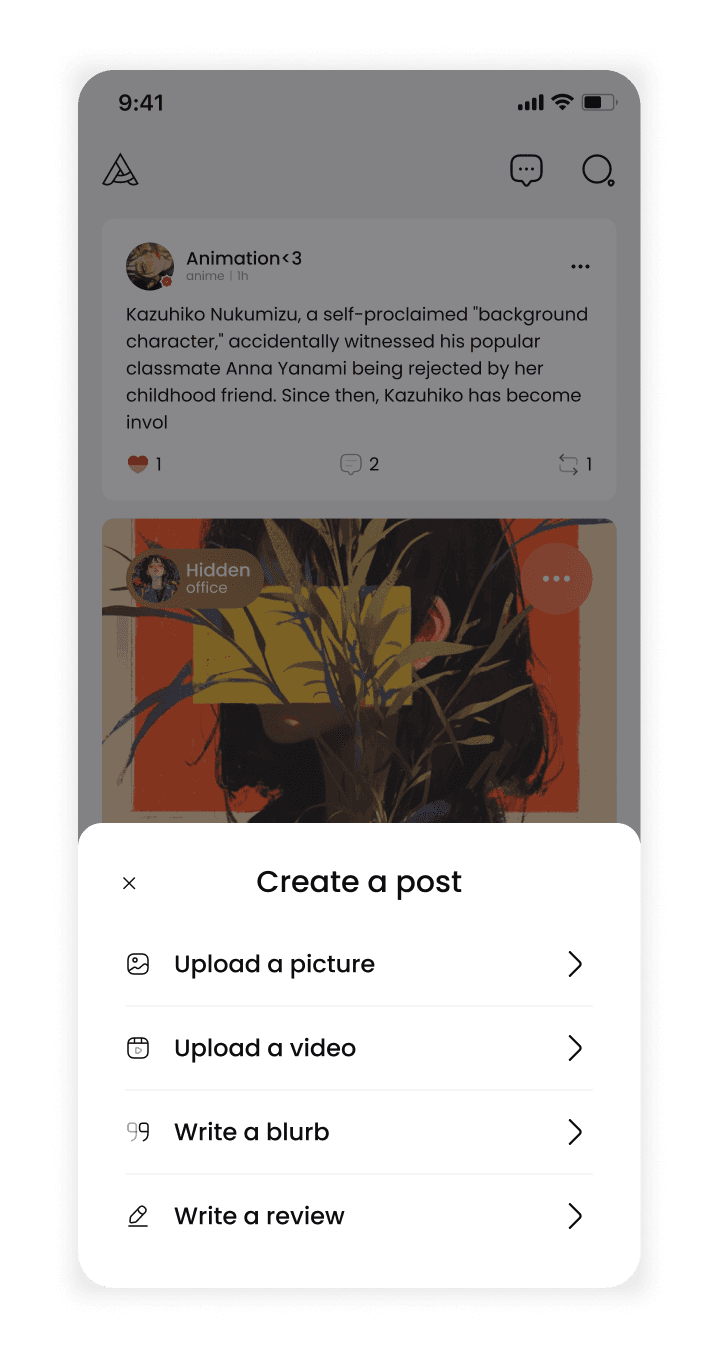
Option 1
This option focused on a half sheet design overlay drawing attention to the buttons.
Option 2
The second option used a scrollable pill layout designed to be less intrusive for users.

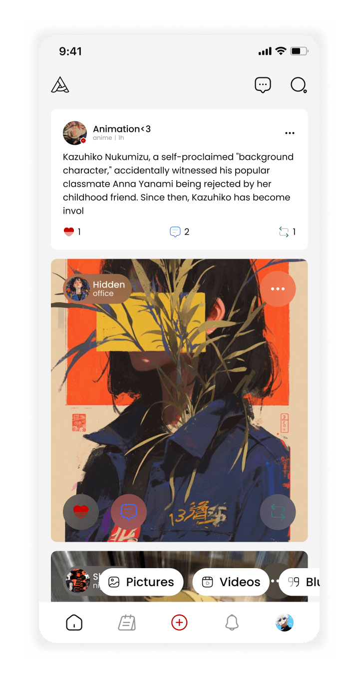
Option 3
The third option focused on having clear, large call-to-action buttons without covering too much of the content.
The design adjusts to constraints while still prioritizing user needs.
After discussing with the CEO, we chose option 3 to include icons and descriptions without disrupting the user experience. I also advocated for better search functionality and a larger media library, but due to time constraints, we decided to streamline media uploads using an API, like Facebook and Discord have in their process.
Improvements
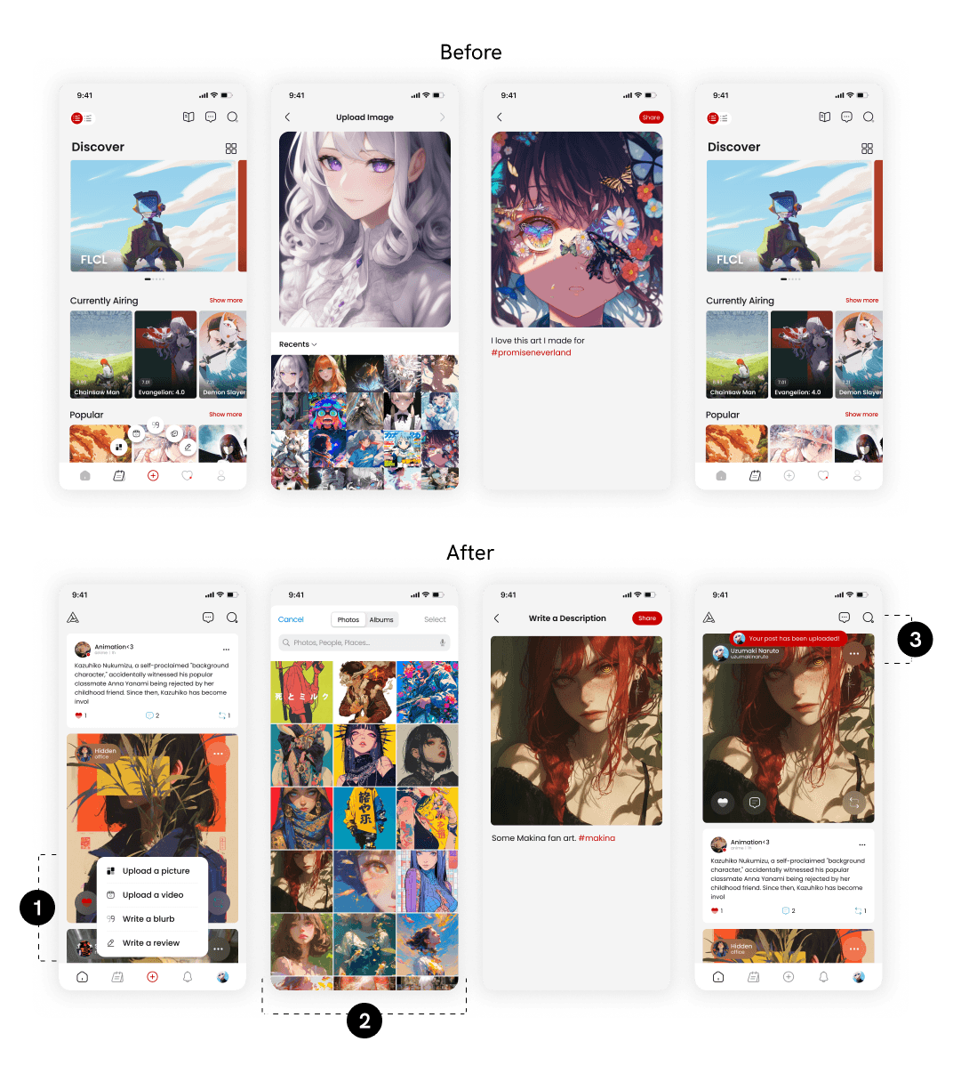
Clear creation CTAs
Clear CTAs help guide users to take action.
API gallery media
The API gallery let users find photos on their phone easily.
Toast notification
The notification lets users know their post has been uploaded.
Impact
Improved efficiency and dev time.
With the tight deadline for the app relaunch, the development team faced numerous objectives and screens to complete. The updated designs not only prioritized user needs but also aligned with business goals. By simplifying the screens, the designs reduced complexity and cut down build time by about 4 weeks. This allowed the team to focus on other tasks and finish development ahead of schedule.
4
Weeks saved in build time
Metrics for Success
Success is measured by user engagement and activity.
The success metrics are based on the main issues identified in the problem. We plan to collect data on user interactions during onboarding and post-creation to see if the changes lead to more account sign-ups and higher engagement in the app.
Drop-off rates
Identifies where and how often users drop out of a process, helping to pinpoint problem areas.
Step-by-step conversion rates
Tracks how many users successfully progress from one step to the next in onboarding and posting.
Completion rates
Measures the percentage of users who complete the onboarding or content posting process.
Takeaways and Learnings
Working with developers and stakeholders to adapt to project scope and technical limits.
The best answer could be the simplest one.
The best solution is often the simplest, and you can get there by working with others. Listening to developers about technical limits and project managers about timelines helps create a design that is easy to use and achievable.
My design process needs to adapt to the scope and constraints.
Going through a UX bootcamp and joining a startup, I learned there often isn't enough time to follow every step of the design process. It's important to stay flexible and make compromises to adapt to constraints.
Next Projects